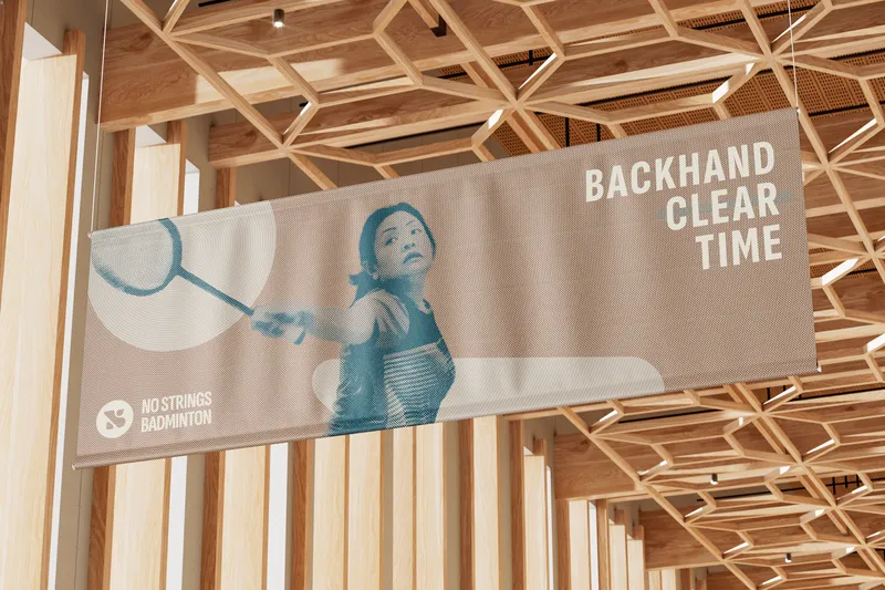
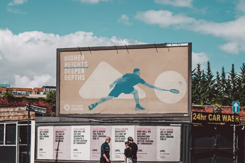

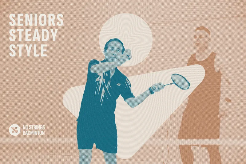
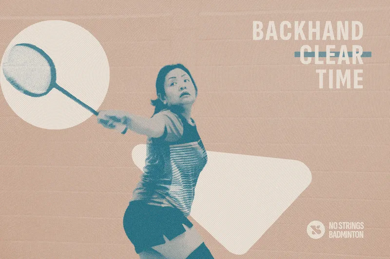
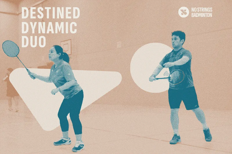

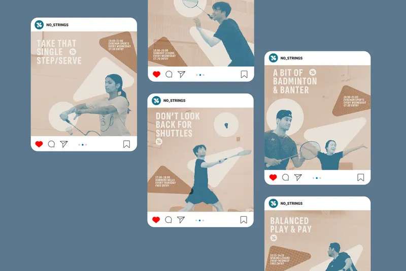
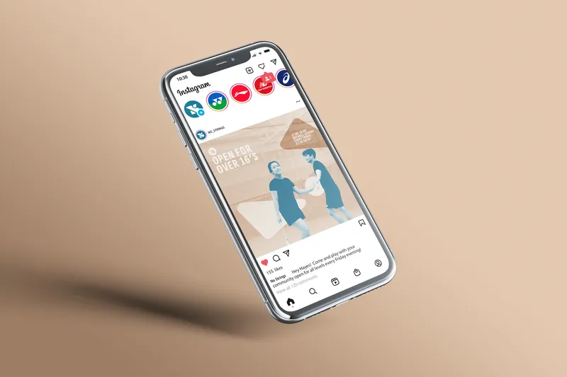
A rebrand of a community sports initiative lead by Badminton England. The campaign aims at the heart of communities, making badminton accessible for all ages and playing levels. Community is what drives the increasing success of this initiative; hence it is only befitting they become the focus and art direction of the rebrand. inspired by old local newspaper, the community become the headlines of the game. The halftone finish providing a pleasant vintage pop, paired with an abstract bird logo crafted out of negatives from abbreviations “NS”.
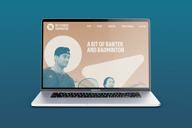

A bit of banter & badminton